Concept
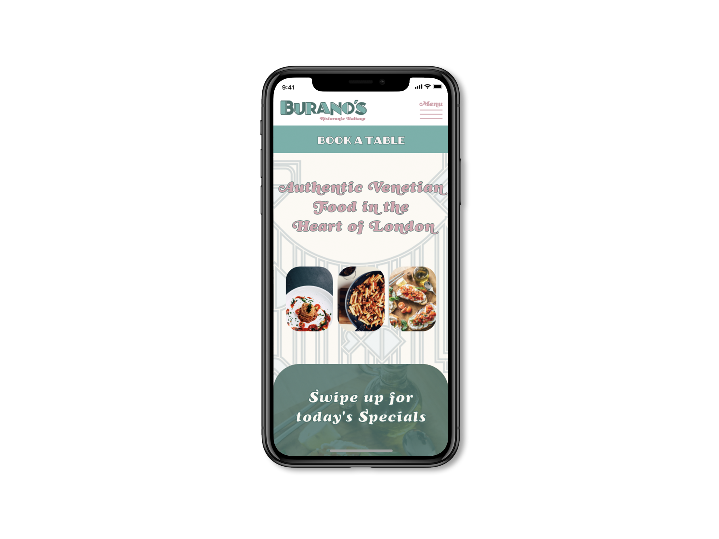
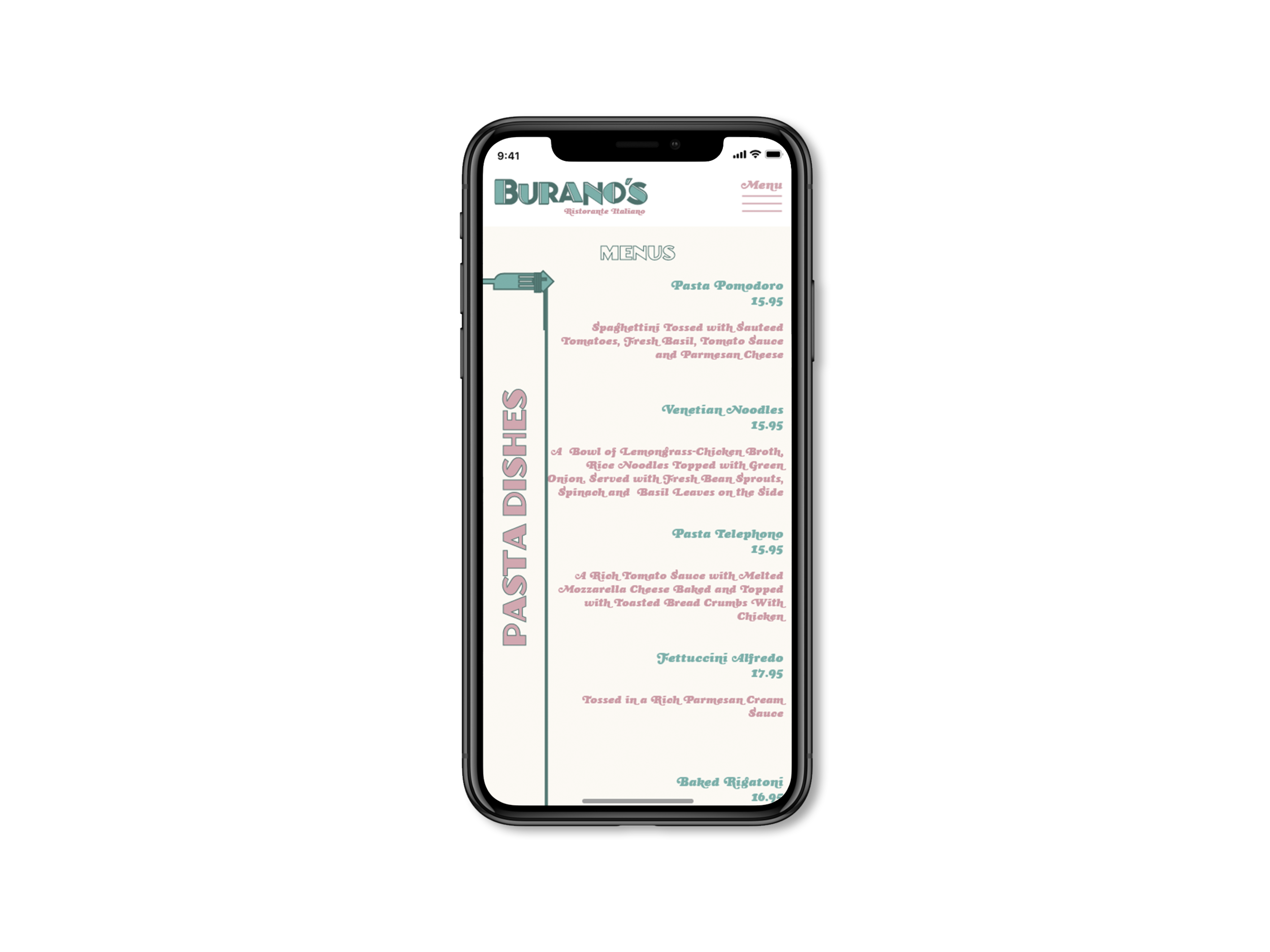
This is an interior and brand creation project for an Italian restaurant in London. The owner asked us to create something that is unlike most Italian restaurants, and goes against the overused clichés people have grown to expect from such an eatery. As a business they focus on Venetian food, which is a little different from a classic Italian menu. Naturally customers can find their favourite authentic meals here, but they are also encouraged to try some of the Venetian region's own seafood delicacies as well.
Name
The name Burano's comes from Burano island - a little Island of the many, just outside the town of Venice in the North-East region or Italy, famous for its colourful houses and seafood eateries- which claims to have the best risotto in the world!
Interior Design
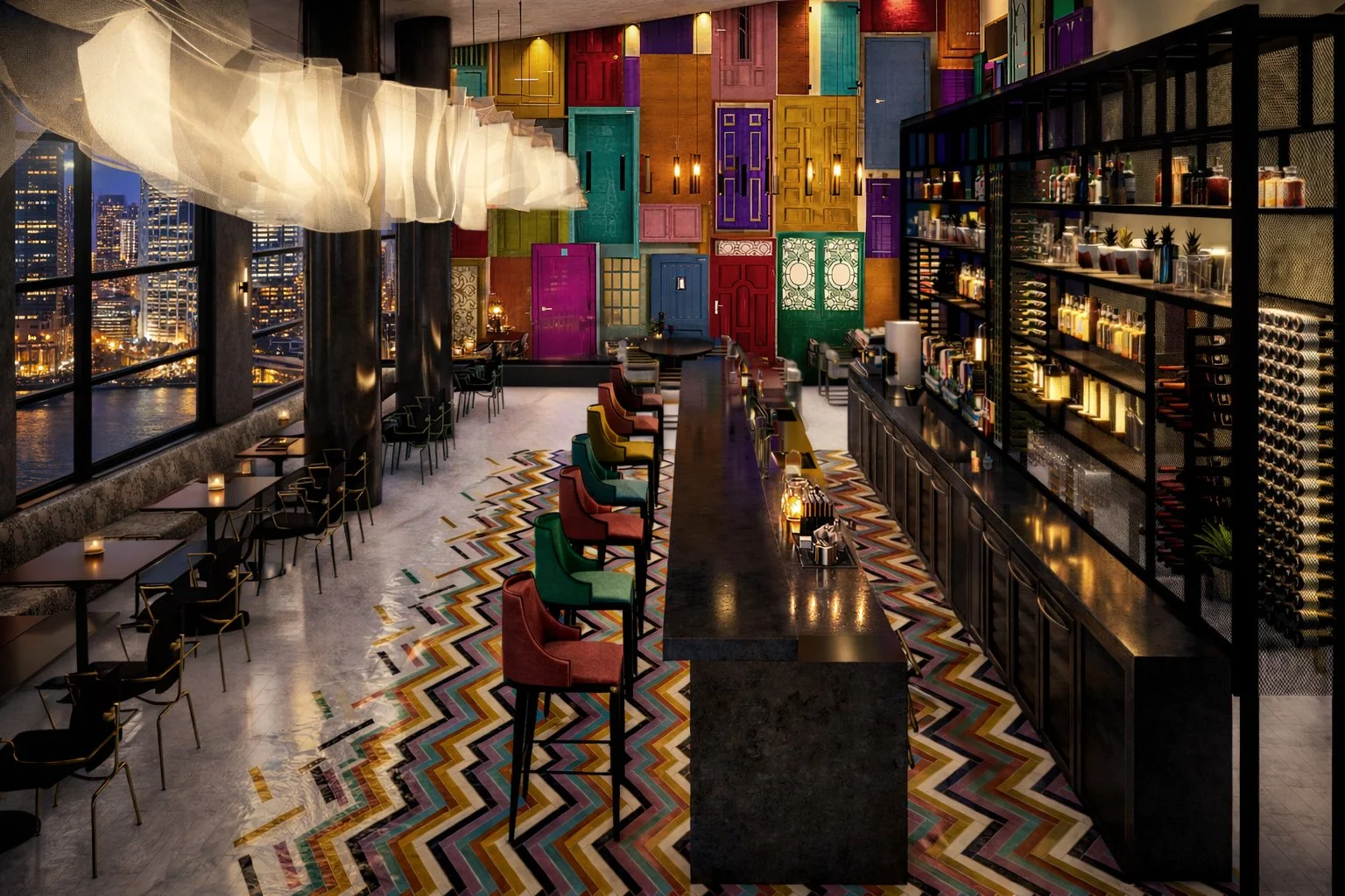
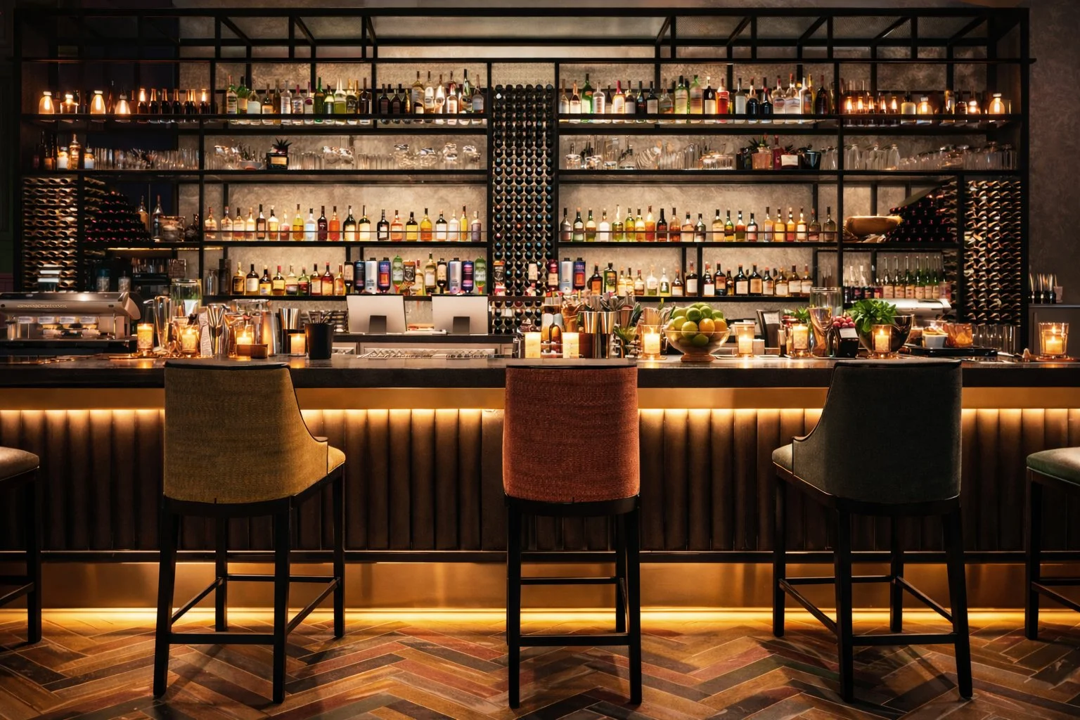
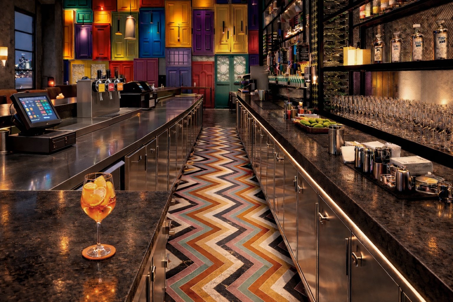
A large, rectilinear bar determines a central organisation for the rest of the space, with banquette seating and dining areas surrounding. The kitchen, toilets and utility space is hidden in the east side of the space. The concept takes direct inspiration from the colourful houses and doors on the island of Burano. An expansive wall showcases a collage of doors, to give the space life and colour. Additionally, art deco furniture and fixtures are scattered across the space to give a sophisticated dining experience. Hints of brass, elevate the interior to create a sense of opulence. Extensive track lighting holds bespoke, rippling-effect lights that resemble hanging bed sheets and laundry, seen outside each house in Burano. Although colour is brought through in the wall and floor tiling, the rest of the space is covered in black and white, in order to contrast and let the door-wall speak volumes.
Branding
‘Fishermen from the island of Burano first started painting their houses in vibrant colours to see them in fog or from a long distance when they return from sea. However... many local guides say that houses were painted colourfully so that drunk sailors would recognise their houses as they came home after a long night of drinking…’
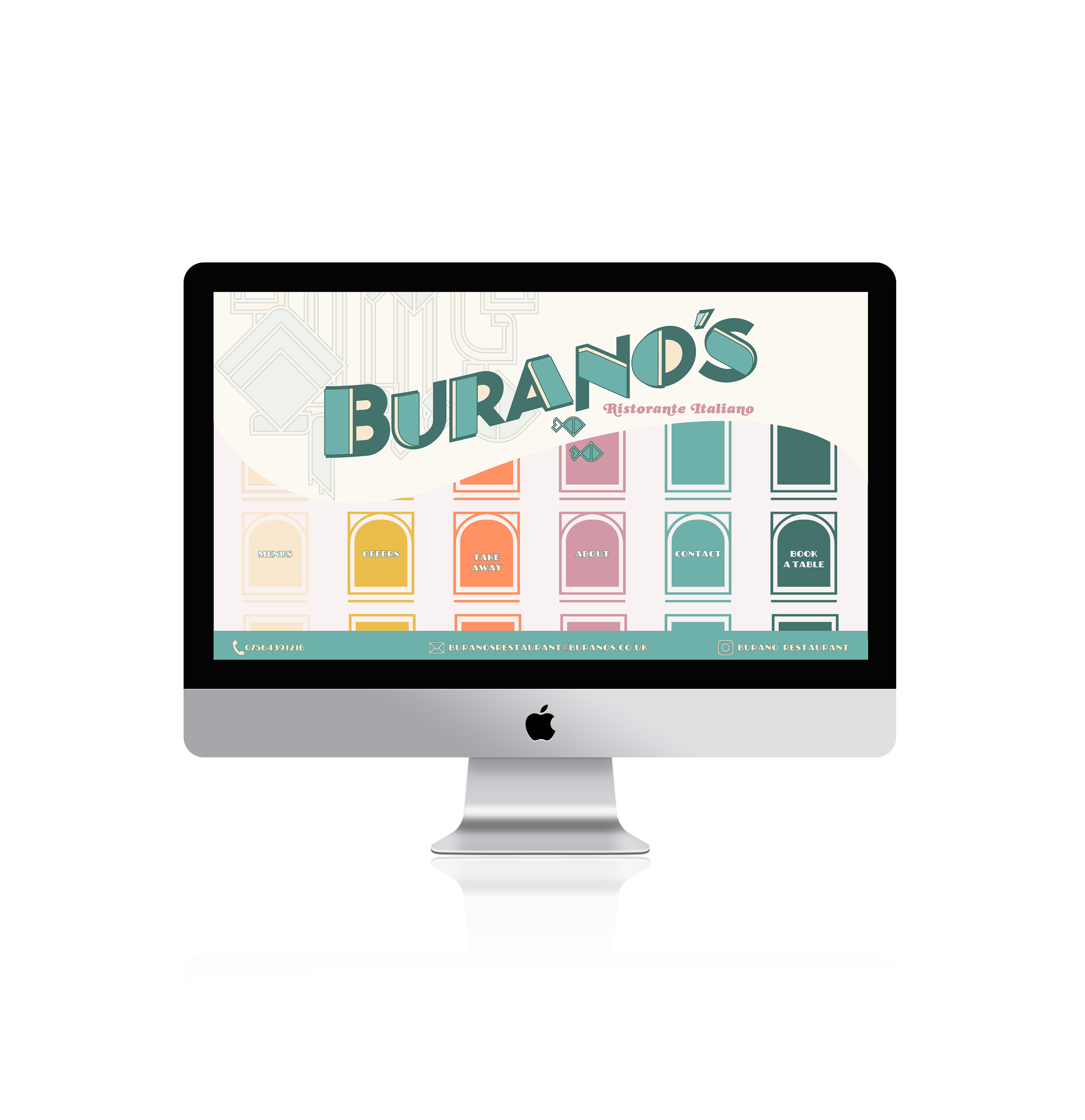
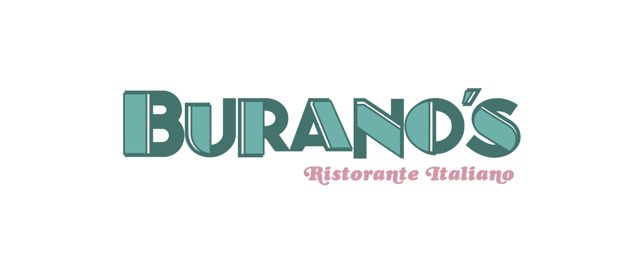
In the design we wanted to reference this funny anecdote - therefore our logo is a little “off” in places: the line weight and the kerning is slightly different with every letter, and the characters’ heights do not align perfectly either. It is almost like you are looking at it after drinking a bit too much…
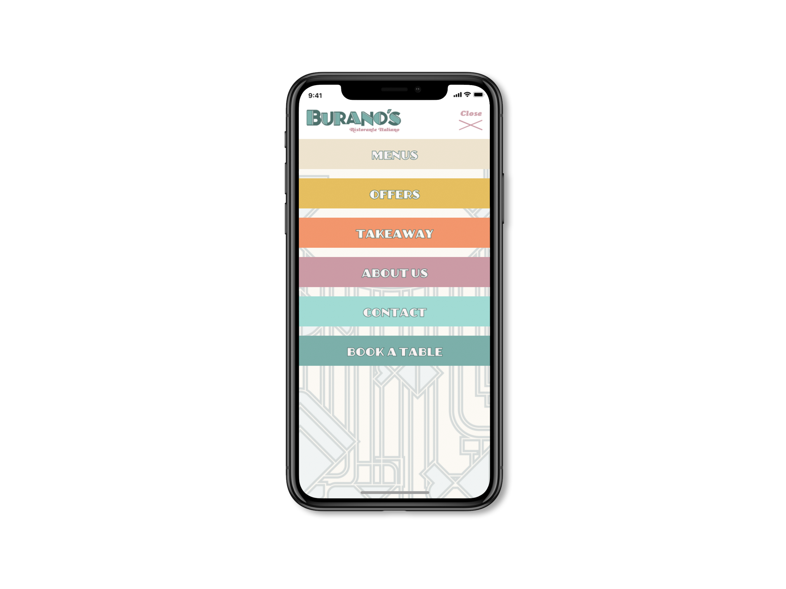
As for the rest of the brand collateral, we have referenced art deco style, mixed with sealife imagery - excluding the usual Italian restaurant design clichés - such as the colours of the Italian flag or glorified images of tomatoes & pasta. Instead, we created a visual language that is both elegant, something new, but also references elements people are familiar with.